
Client story
Designing an investment product
We designed a micro-investments product in cooperation with SEB Bank.
Overview

Together with the SEB Bank’s UX design team, we designed a new investment product – micro-investments, the purpose of which is to help provide easy-to-understand information to both new and more experienced investors about where to invest, how to place orders and manage your portfolio and, if necessary, to sell ETFs (exchange-traded funds).

„We chose Trinidad Wiseman as our UX partner for various reasons. First, they were ready to quickly sign a contract with us, which showcased their flexibility and dedication. Additionally, they have unique and long-term expertise in UX.
Their years of practical experience and reliability along with a systematic and methodical approach gave us the assurance that they would be able to successfully lead large and complex projects as well. SEB’s and Trinidad Wiseman’s way of thinking and values also overlapped, which provided the foundation for strong and productive teamwork.”
- Madis Rist, Baltics Design Team Lead at SEB
The challenge for the team: design a new investment product in 6 months
Experienced users who already have the financial know-how can invest their money via online banks in many different ways. However, the solutions offered by online banks for this tend to be rather complicated and technical. The Robo-Advisor was recently created specifically for less experienced investors, which manages a user’s investments automatically based on the results of a questionnaire of the user’s preferences.
But the need for another product surfaced, which would fit in-between the two, meaning that it would provide the user with more freedom of choosing where and when to invest, but would still be as easy to use as possible and understandable for a new investor as well.
The 3 main requirements for the new product

Support in decision-making
Users need a convenient option that would allow them to start investing or to supplement their portfolio in a way that does not require too much specific knowledge, time or a huge financial contribution.
In other words, it was necessary to figure out how to display basic information about investment options and how they compare to one another that would be comprehensive enough and understandable.

A simple and transparent buying and selling process
A lot of users were scared that the buying and selling process would be too complicated and include so-called hidden costs.
In other words, we needed to create a buying and selling process that would be as simple as possible, fast, and transparent about all involved costs.

Convenient portfolio management
Users wanted to feel secure in the fact that after placing an order, they could manage their investment portfolio by making well-informed decisions.
In other words, we needed to design a detailed portfolio overview that would also show upcoming transactions. Buying more and selling needed to be simple processes that involved costs as low as possible (the transaction fee is 0,5% of the transaction total and there is no required minimum fee).
The project was divided into two stages
Mapping the needs
- In-depth interviews with the project’s key stakeholders
- Kano questionnaire for mapping the users’ expectations
- In-depth interviews and usability tests with the useres
- As-is and to-be process analyses
- A competitive analysis of the competitors and trends
Designing and testing the product
- A workshop for mapping and sketching solutions
- Evaluating and prioritising the solutions with the project’s key stakeholders
- Prototyping
- Usability testing
- Continuous monitoring of the requirements with the developers and lawyers
- UI design
- Supporting the creation of a public product page concept with the marketing team
One of the most important steps of the first stage was mapping the expectations of the Baltics users. As a result of this step, we found out which features the users value the most.
For example, the Kano model divided the customers’ expectations for the investment product into three categories:
- basic expectations (must be);
- performance expectations (performance);
- surpassed expectations (excitement).
As a result of the in-depth interviews, we found out what challenges the users currently face when investing, what criteria they have for making decisions, and what their wishes were for the future.
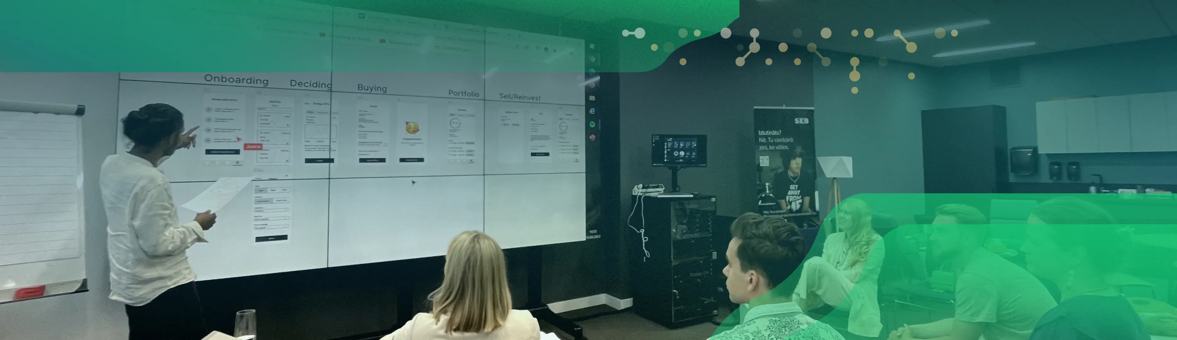
The highlight for the second stage was a 1-day workshop held in Riga, where we gathered all of the key stakeholders from Latvia, Lithuania and Estonia.
The lead group consisted of the UX researcher, UX designers, business developers, and representatives of the customer segment. By the end of the day, we had created an initial draft of the product in Figma, which we were also able to test with users at the end of the very same day. This helped us validate whether the project’s key stakeholders’ vision matched the users’ expectations for the solution.
We agreed on the features and requirements for the MVP
Before prototyping, we created a list of all the features and requirements for the new product that we had gathered from various sources.
The list included ideas from the users, the project’s key stakeholders and the UX designers. Since it may not be feasible or reasonable to fulfil everyone’s wishes, we needed to evaluate them.
We evaluated the ideas based on three categories:
- how much is this feature wished for by the users?
- how much business success could this feature bring?
- how easy is it to create this feature from the point of view of back-end development?
We added up all of the points and came to a common understanding of which features would be included in the MVP (minimum viable product) and which ideas would either be left to the future or completely out of the product’s development scope.
Prototyping provided the designers with lots of freedom
This was the most memorable part of the project as it gave the designers the opportunity to express their creativity as much as they wanted to. Over the course of this phase, we changed the design of the prototype three times. Smaller changed were made nearly on a daily basis.
As soon as the first version of the prototype was ready, we tested it with users from all three countries, made amendments, and started testing the next version. Once the interactive prototype was confirmed, we started work on the UI design.
During the final phases of the project, we worked together with the marketing team and the customer segment representatives to ensure that the soon-to-be created public product page would also reflect everything we had learned from the users. We wished to use the product page to present the product’s value and uniqueness.
We started work on the design by dividing the information into five topics
The goal of this division was to achieve transparency AKA important information should always be available to the user
- information about ETFs (exchange-traded funds);
- information about transaction fees;
- frequently asked questions;
- a calculator for calculating potential growth;
- portfolio view.
Then, SEB picked out the 10 most popular ETFs to offer to the customers. We only displayed those criteria about the ETFs that were most important when making a purchasing decision. We also made sure to display the data in a visually attractive and informative manner – for example, we used country flags, graphs, colour-coded risk levels, the simplified names of the funds etc.
We also made it more convenient to learn more about ETFs – we added a simple short description that would be understandable for the average person, the areas and main companies that the ETF invests in, its risk level along with a description of the risk level, an overview of its previous years’ profits or losses, and which official ETF website the user could get more information from. To make the decision-making process easier, we also added in the feature to compare ETFs.
We designed the buying process to be as short and simple as possible
The user only has to go through 4 steps and the whole process only takes a couple of minutes. We removed all unnecessary steps and information and only kept the most elementary and legally required parts.
For example, we did not wish to exhaust the user by requiring them to open an investment account during the buying process. Instead, we decided to automatically open the required (and free to manage) account for them automatically along with the first transaction.
But the transaction fee and dates are visible in nearly every step as that information is important to the user. This way, the user can focus on buying what they want in a sum suitable to them, and also set up either a one time or regular investment order. The user also needs to make a minimal amount of decisions when selling: they decide what to sell, for how much, and which account they want their money to be sent to.
We designed a portfolio view that is as compact and convenient as possible
This way, the user has an overview of the growth of their ETF portfolio as a whole and they are also able to check the status of each individual ETF (profits, losses, purchasing price, market price etc.). Buying more or selling are just one click away.
As transactions only take place once a week, then the portfolio also provides a list of all upcoming transactions that the user has placed orders for, whether they are buying, selling or regular investment orders.
The list can be used to conveniently cancel orders as well – this flexibility decreased users’ anxiety and they liked knowing that they always have the option of making changes to their orders if necessary.
“Already in the workshops, we saw how Trinidad Wiseman’s structured approach and guidance helped us move in the right direction. Thanks to the team’s dedication, we now have an investment solution that is clear, intuitive, and user-friendly. It’s easy to market because the entire customer journey is logical and requires no extra explanation. A big thank you for keeping us firmly on the right course!”
- Janno Rasmus Dreger, Marketing Segment Manager at SEB

A new product for trading global ETFs was born
In cooperation with the SEB product owner, business developers and development team, we created a new product that allows users to trade global ETFs.
All of the users’ buying and selling orders are gathered together and executed by SEB once a week. Thanks to this weekly frequency, the fees per transaction are also minimised.
The results of the project that we handed over to SEB:
- a summary of the project’s key stakeholders’ expectations;
- a summary of the users’ expectations;
- a summary of the possible solutions;
- a summary of the prioritised features;
- an interactive prototype that had been tested with users (computer view, in Figma);
- a prototype with the final design (computer, tablet and mobile views, light and dark mode, in Figma) to be used as the basis for front- and back-end development.
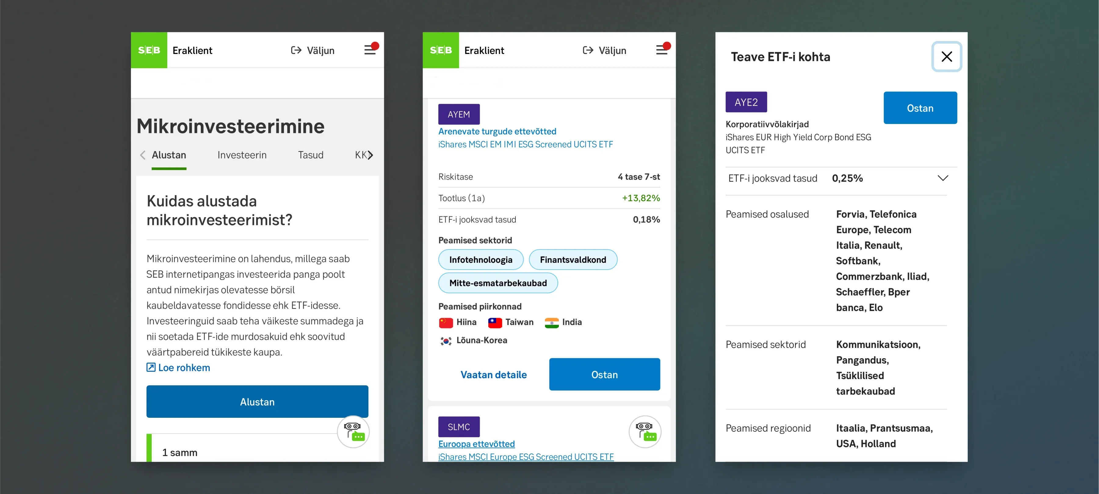
The first 3 steps of micro-investing in mobile view.
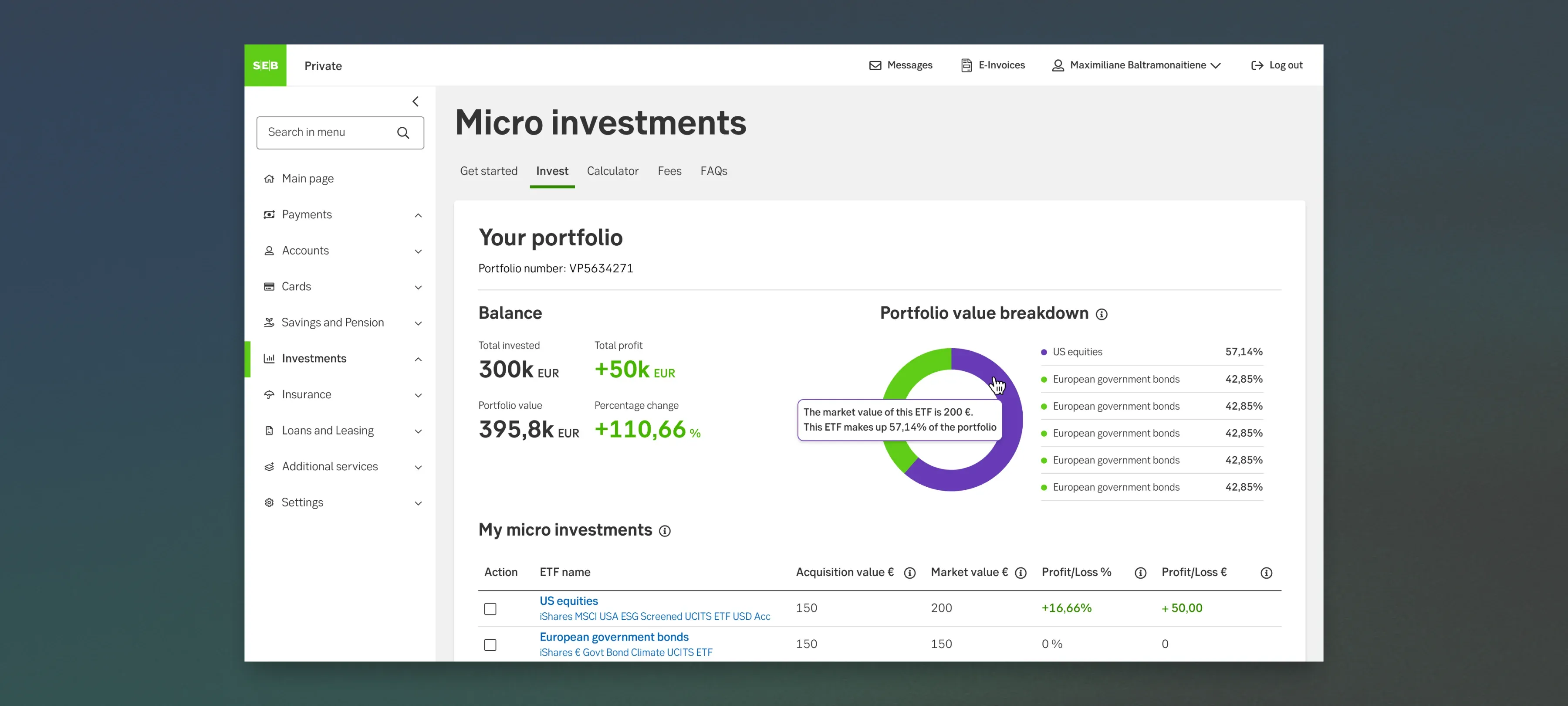
The micro-investments portfolio view.
The key to a successful project is strong cooperation with the client
As in many other projects, the key to this project’s success was once again tight cooperation and constant communication between the different parties involved. Already during the project, we discussed the efficiency of our work processes and quickly realised that we would have to continue in the same way.
The key to the project’s success was in the contributions made by all parties and in having a common understanding of cooperation:
The preparations were done
- Preparations with the users and key stakeholders. Prior to the UX designer getting involved, the UX researcher had already begun work on mapping the expectations and needs of both the key stakeholders and the users. This provided a good foundation for starting UX works and for making decisions on how to continue.
- Preparations with the vision. The business development leads had created an initial product sketch in Excel and Word, to show what the product journey could look like. This made it easier to understand the client’s vision and the user journeys.
All required parties were involved
- Implementing two designers at once. The UX designer worked together with another UX/UI designer as part of the cooperation in this project. This provided the opportunity to bounce ideas back and forth on a daily basis, to prototype different solutions, to supplement each other’s design and to quickly move forward with the UI design. If the same UX designer is also involved in the UI design, then no important information gets lost when handing over the project.
- A determined product owner. The project was led by a proactive product owner who always made the final decision and very skilfully kept to the project’s scope. He did not set any limits to the designers’ creativity but guided them enough to stick to the limits set by feasibility and deadlines.
- Involved business development leads. The business development leads participated in the user interviews and tests and were thus able to later combine the business and user interests during the product development process.
- Involved marketing team and segment representatives. The marketing team and customer segment representatives were also involved – they had a very good understanding of the users’ wishes and how to position the new product.
- Coordination with the lawyers. The product owner and business development leads were in constant communication with the lawyers to validate whether the prototype was in accordance with legal norms and SEB’s values. During the project, we created a separate prototype for the lawyers that they could use to go through the buying journey themselves when discussing this subject. The provided solution was confirmed within a couple of days.
The work process favoured co-creation
Daily meetings with the whole team involved the business developers and the developers who all gave their feedback to the feasibility of the proposed solution already during the ideation stage.
Bigger decisions were made during the weekly business development meetings and the weekly development meetings were used for constantly checking over each other’s work and for specifying earlier and introducing new design elements and features.
“A product idea that has excellent UX/UI was exactly what our customers and employees needed. We can see that our bank’s customers value UX/UI that meets their needs so much so that the micro-investments target group ended up being much wider than we initially anticipated.
We have earned a lot of new customers whom we did not even know to see as a target group initially, and who are now using the micro-investments product simply because the UX/UI meets their expectations.”
- Skirmantas Matelis, Product Owner at SEB
The new solution affects the future of a lot of people
If the user is new to investing, it can be complicated to understand all the details involved. However, not being able to understand the fine and complex details should not mean that the user loses the opportunity to invest in their future.
Saving and investing along with a proper pension pillar creates a good foundation for financial stability and financial independence. This new product is wanted and awaited on the market as it enables people to feel comfortable when investing, both those who have no earlier experience in the area as well as those who are already involved in it.

“A big part of how the team worked together was invisible to me, but the results, the workshops and the presentations were always excellently prepared and done. Our partners mentioned this multiple times and had a lot of praise for it.
I was deeply impressed by the methodical and rational working approach. I liked how the UX designer could remain neutral during debates and, if necessary, intervene with a well-founded standpoint.
The project planning was well-structured and clear. The workshops were always oriented towards results, logical, and made us step outside of our comfort zones just enough.”
- Esko Lehtme, Product Owner of UX at SEB

