Client story
Digital Traffic Accident Notification System
In cooperation with the Estonian Motor Insurance Bureau, we set the goal of creating a digital alternative to the infamous “yellow page” for traffic participants.
Overview
Trinidad Wiseman developed a digital solution for traffic accident notifications in cooperation with the Estonian Motor Insurance Bureau. The project’s goal was to make submitting a report after a traffic accident faster, more precise and user-friendly for people.
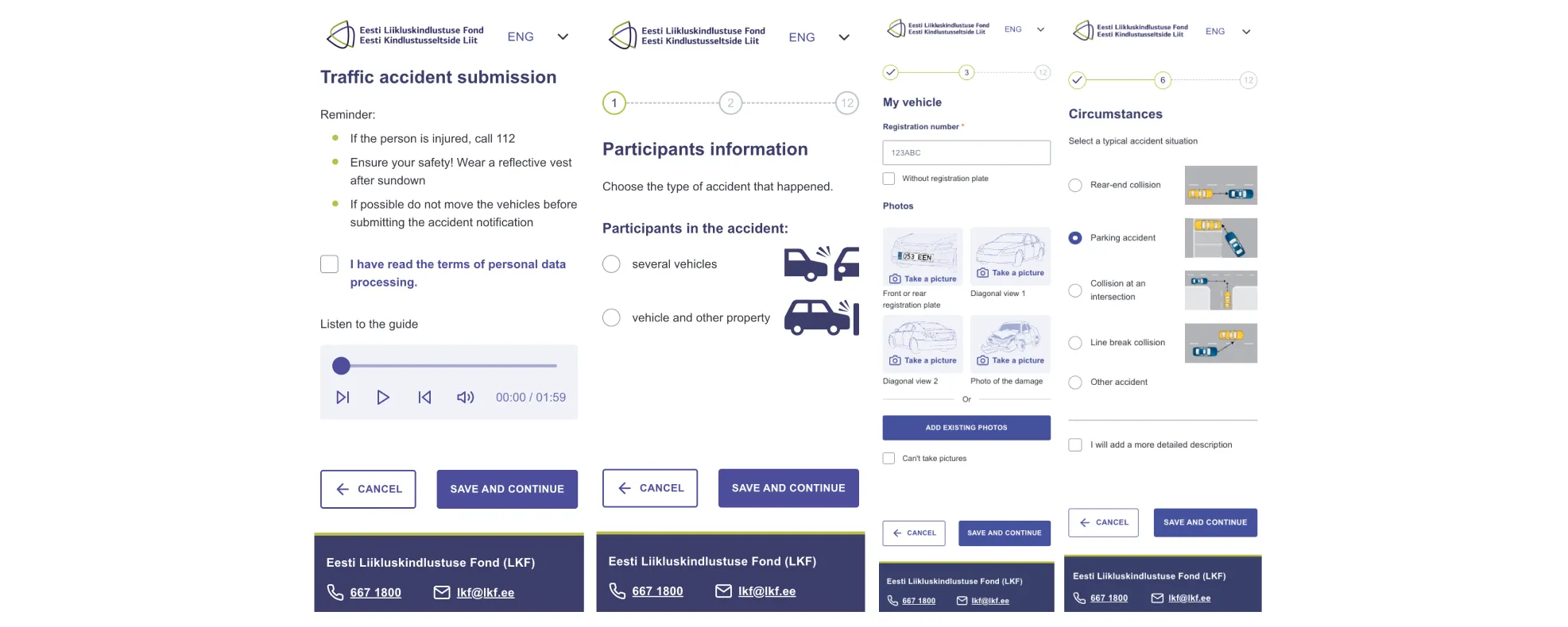
The result of this project is a web application that enables parties involved in an accident to take advantage of Estonia’s e-country infrastructure to quickly and conveniently submit the required information to their insurance providers. The application is the first of its kind in the world. The new solution is currently being used in nearly 50% of all traffic accident cases in Estonia.
Within six months in 2024, 8371 traffic accidents were reported via avarii.ee.

“Creating the application had both the Estonian Motor Insurance Bureau as well as Trinidad Wiseman facing some big challenges as we had to consider the needs of all traffic participants, regardless of their age, nationality or IT skills.
In cooperation with Trinidad Wiseman, we were able to create a solution that has now become the market standard for submitting traffic accident reports.”
-Taavi Kiibus, Head of Digital Service Development, Estonian Motor Insurance Bureau
What problem did we start to solve?
Traffic accidents are complex events where fast and precise exchange of information is crucial.
Traditionally AKA until 2022 the “Traffic Collision Report” was exclusively filled out on paper, which was quite difficult for people and often resulted in imprecise reports due to manual mistakes. In the case of milder accidents, the parties involved could not reach a mutual agreement and authorities were often unreasonably involved.
The new solution was mainly targeted towards two user groups: traffic participants and insurance companies.

Traffic accident report submission process
-
the form is paper-specific and thus requires the presence of said form;
-
it is often unclear to users which specific case type has taken place and how it should be correctly recorded;
-
users' handwriting, style and skills to complete the form are different. Consequently, the quality of the filled form is uneven;
-
when drawing up a claim, the parties involved focus more on finding the culprit than on documenting the situation - in the event of a dispute there is not always a fixed point of reference;
-
1 person can complete the form at a time, and there is just one copy. Storing information for multiple parties requires either multiple fill-ins or taking pictures of the original;
-
the information filled on the form is static and must, as a rule, be duplicated to the digital format provided by the insurer.

The biggest challenges
-
The new digital solution must be accessible regardless of the time or place.
-
Traffic participants have very different profiles, but they all need one common system. Submitting a lot of information precisely must be doable via a simple and understandable user interface.
-
To limit the flow of traffic as little as possible, it makes sense to be able to submit data in multiple parallel devices.
-
The application’s technical scalability must be as dynamic as possible to account for the irregularities of traffic accidents.
How did we resolve the challenges?
During the planning phase of the project, the team quickly came to the understanding that the new application must be web-based.
In contrast to a native app, a web app would be immediately accessible in most cases and when the user has access to the internet.
During the project discovery phase, we mapped out that traffic accidents happen to all kinds of drivers across the board, so the application must be unambiguously understandable and usable for both an 18-year-old man and a 75-year-old woman.
To serve as wide a user profile as possible, we followed the principle of ease and very consciously created a limited number of visual elements to be used throughout the application. The backbone of the application is made up of data collection forms which have been cleaned of all possible extras and add-ons.
The result is an easy to read, clean, clear and familiar user experience.
Traffic accidents and the insurance cases involved often also include property or financial damage to the parties.
The injured party’s damages are reimbured by the insurance company, but the responsible party must cover their own costs. This means that defining who is the injured party and who is the responsible party is an activity that is ideally resolved by the parties involved, but oftentimes, situations occur where they cannot reach an agreement and the final decision falls to the authorities on the case.
A fair decision requires a complete overview from all parties.
To provide such an overview, we created a feature that enables all parties to separately submit data about the case from separate devices. The creator of the case document can share access to the case file with the other parties via a QR code or an SMS. Everyone can see that data submitted by other parties but not change them.
The result is a solution that provides an impartial overview of the case and fair grounds for sharing responsibility.

Traffic by its very nature is unpredictable and this is reflected in the need to provide access to the application during different load times.
By taking a very simple approach, we could always plan for the maximum potential user count, but using such a standard for planning would result in the unreasonable use of server resources at most times.
The solution here is to ensure the dynamic scalability of the server where the server’s power is controlled by a load balancer, and during moments of higher traffic, additional computing power is created within the server. To achieve this, we took the dynamic scalability approach when planning the project’s architecture.
In cooperation with the Estonian Motor Insurance Bureau, we set the goal of creating a digital alternative to the infamous “yellow page” for traffic participants. As a result of tightknit and direct teamwork, the web application avarii.lkf.ee was born and by the summer of 2022, it was used to report every third traffic accident in the Republic of Estonia. It is unlikely that the traditional paper form will lose its value completely anytime soon, but as of today, we have already made a huge leap towards becoming an even more digitalised society.
You can read a more thorough case study on our blog How we sought to plan the unplannable, i.e. how we digitized the process of reporting traffic accidents

